

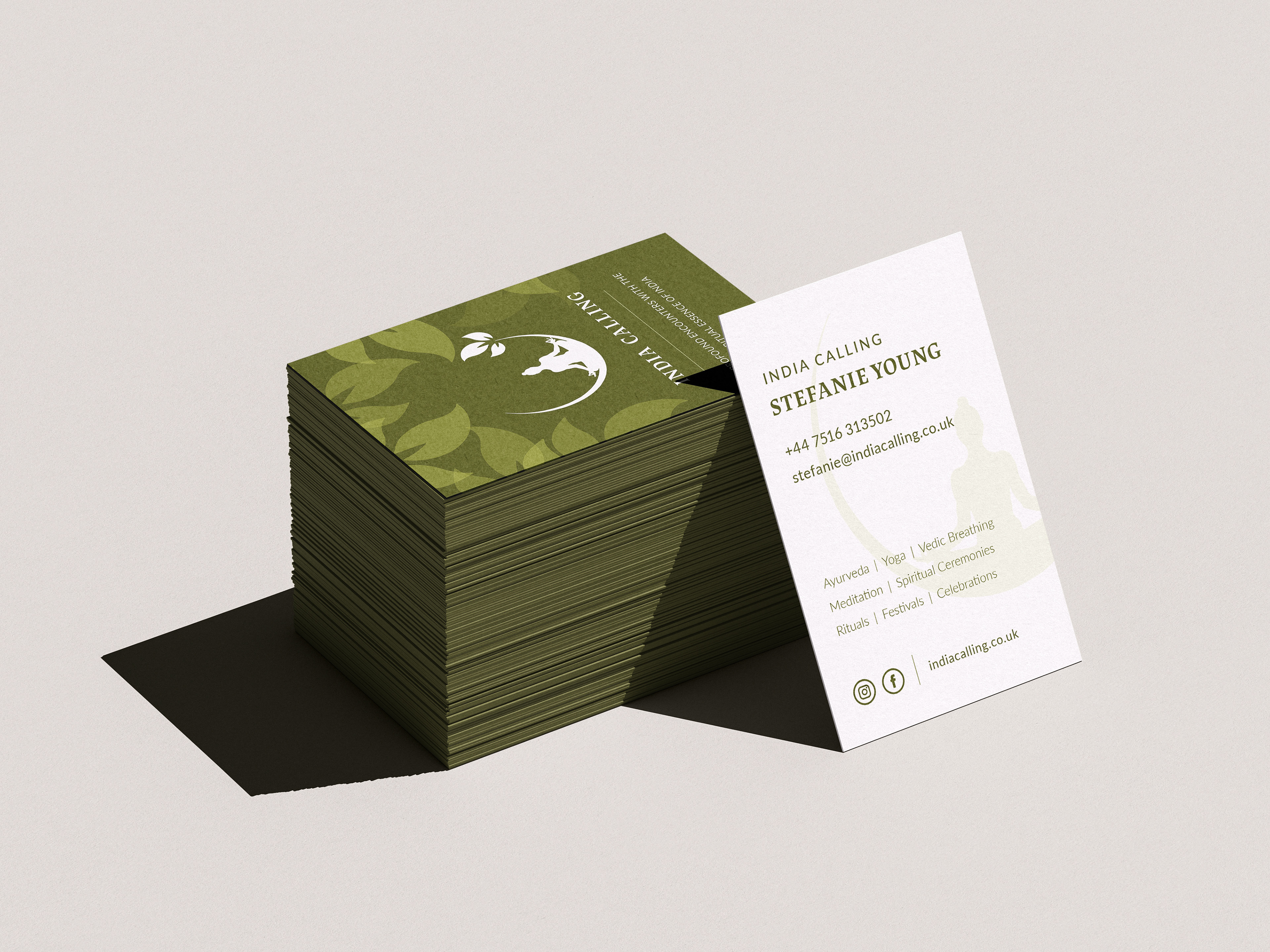
This project required a new set of business cards for the spiritual India Calling. The client wanted to keep their original logo, and wanted green to be their primary colour. By extracting the leaf shapes from the logo, I was able to create a layered effect onto the front of the card, while leaving the back relatively calm and refined.