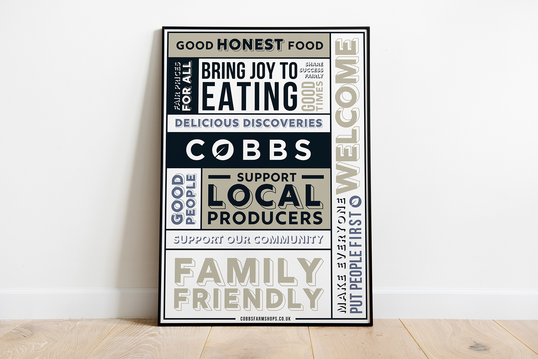
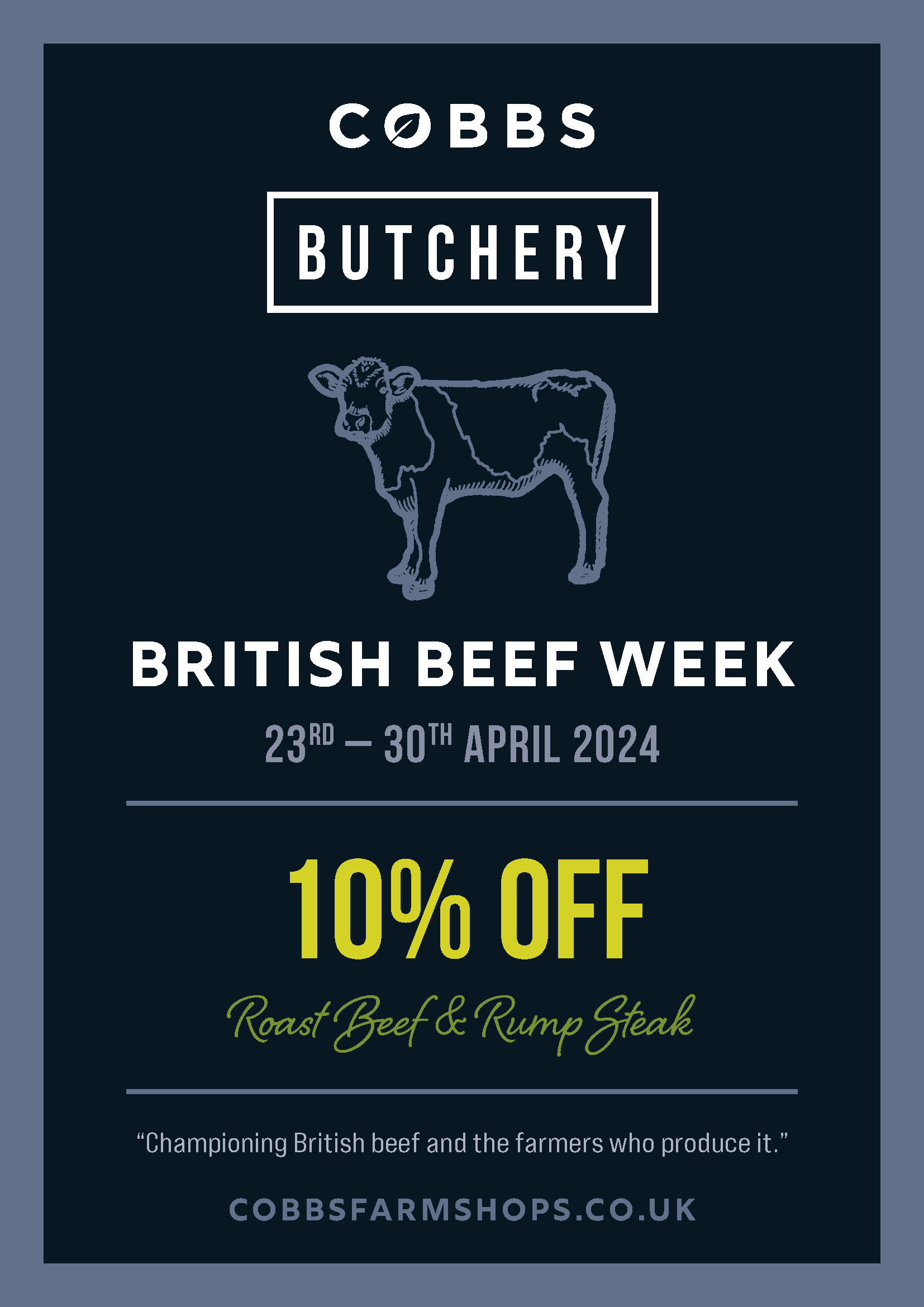
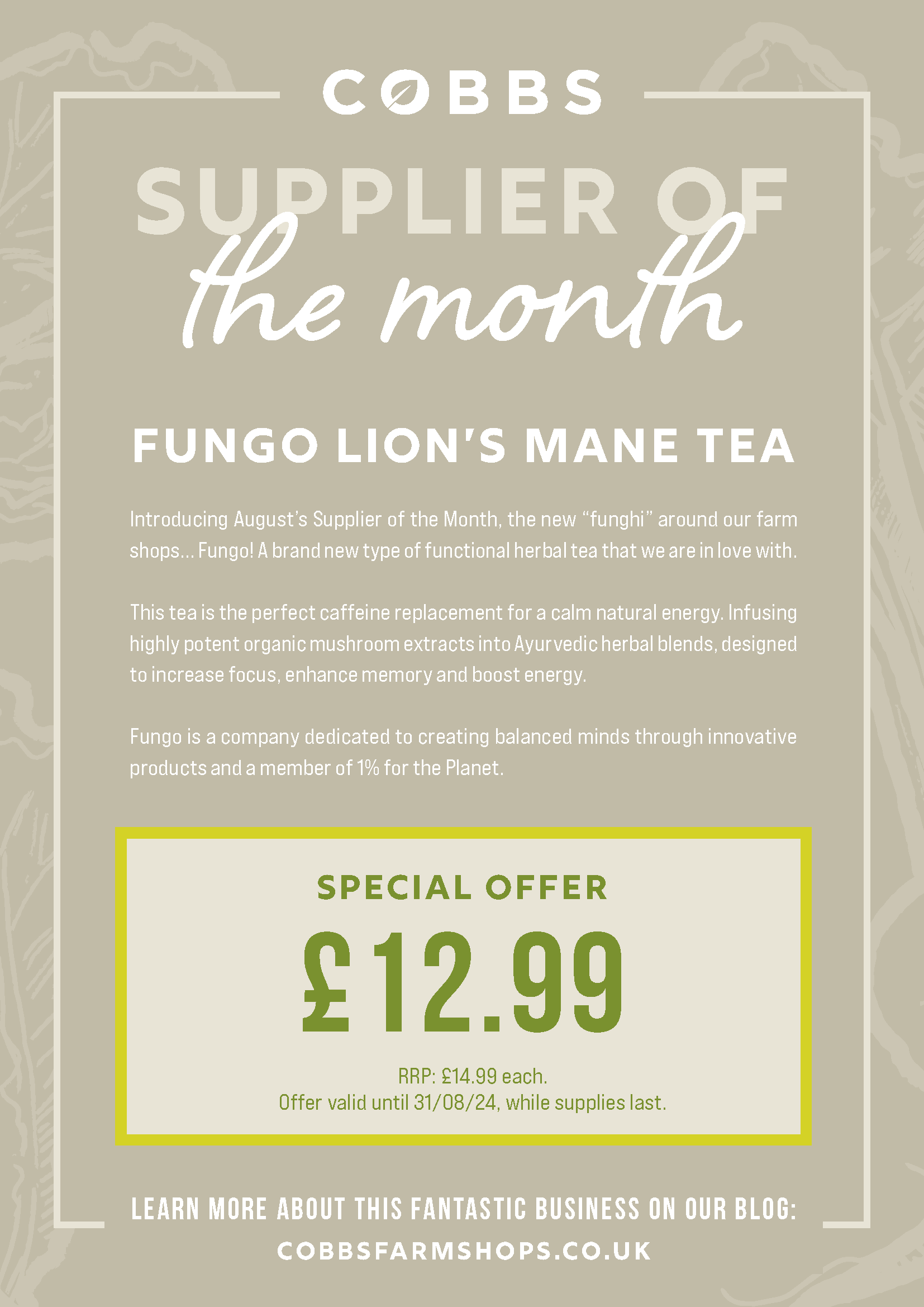
Examples
Below are a couple of example posters we drafted up for the client as an idea of how they can apply their new brand to printed materials in the future. Both include the Primary and Secondary palette, as well as the custom illustrations.
Palette
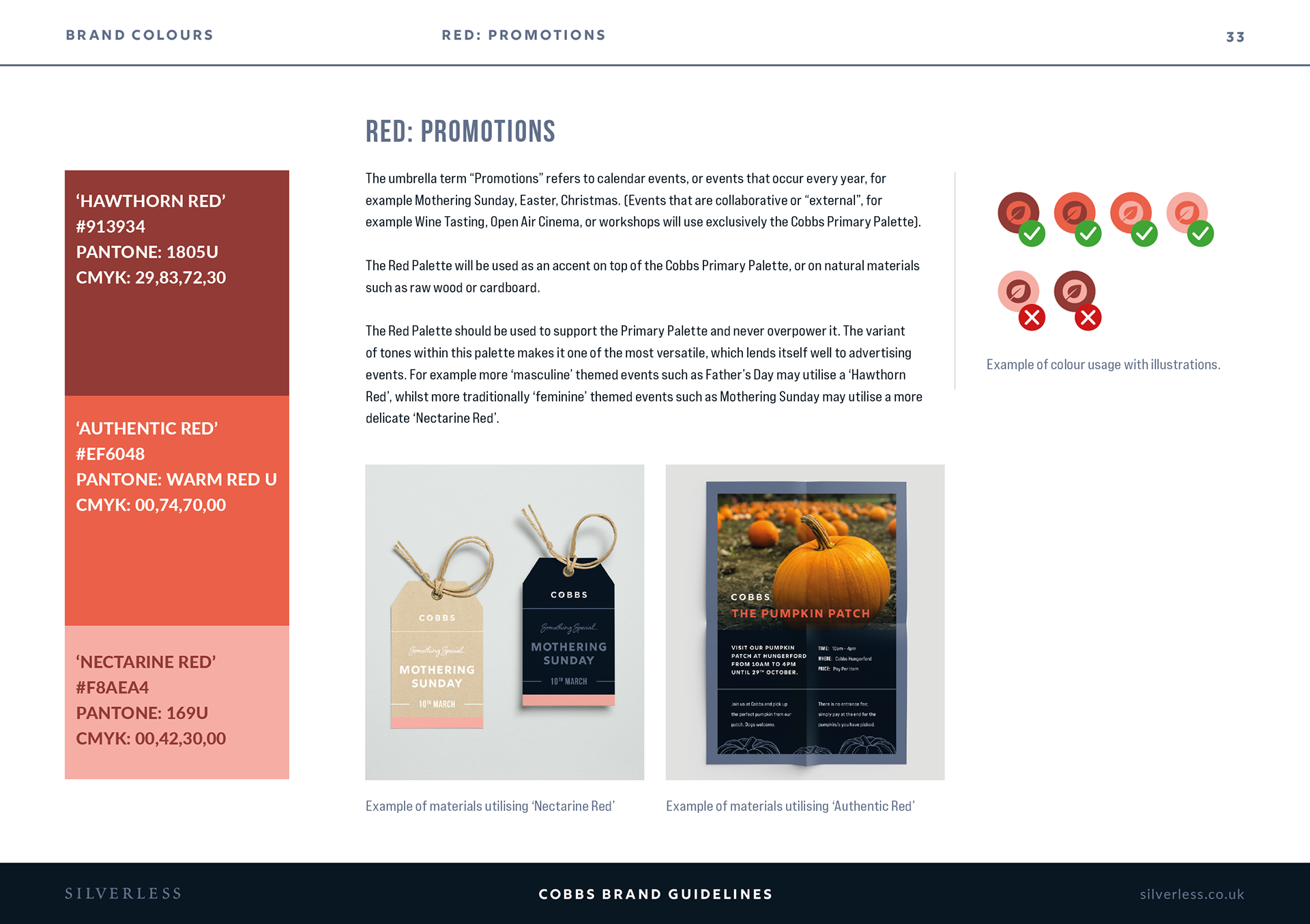
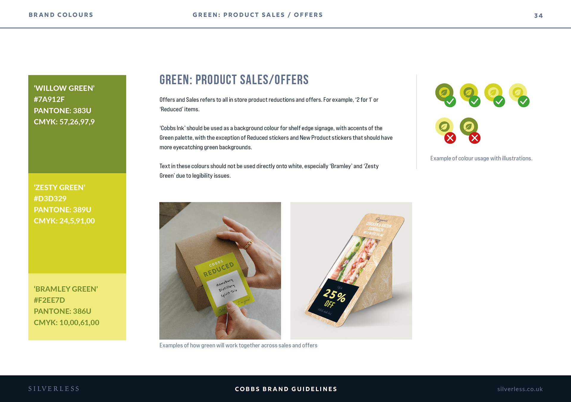
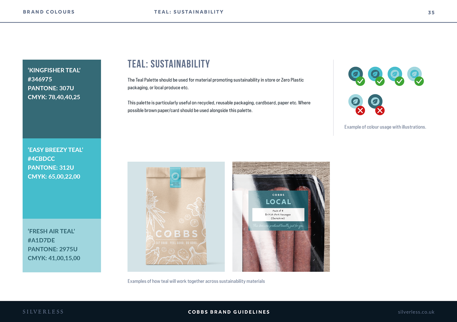
We needed to give Cobbs a strong brand. One that was versatile, eye catching, and one that make them stand out from the crowd. With a base palette of inky blues and warm beiges, the client wanted the sectors in-store to each have their own identity. So, we created the Secondary Cobbs palette. Each colour set represents a part of Cobbs sales. For example, Reds are Promotions, Greens are Offers, Teal is Sustainability and Oranges are Allergens. These bright zingy colours cut through the muted base palette and add beautiful features to their marketing.

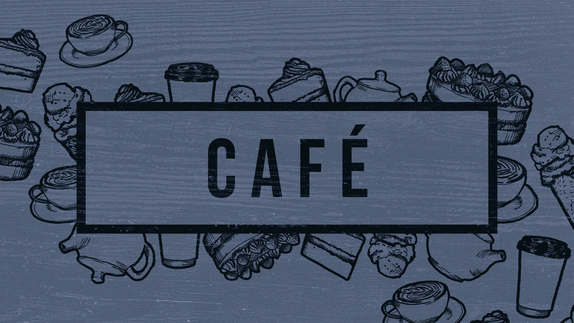
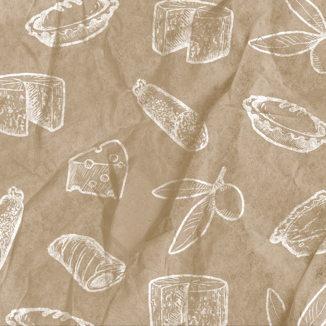
Illustrations
Below is the full set of illustrations I created for Cobbs. They required a set for each area of the store as well as some extras for decoration purposes. We wanted to give them texture, and a sketched look, as well as making them bold and distinguishable at a small size. For this reason we used three sizes of e-brush on Photoshop, small and medium for detail and large for the outline. These illustrations work perfectly as design features as well as watermark style pattern.

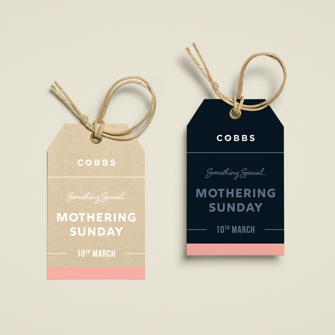
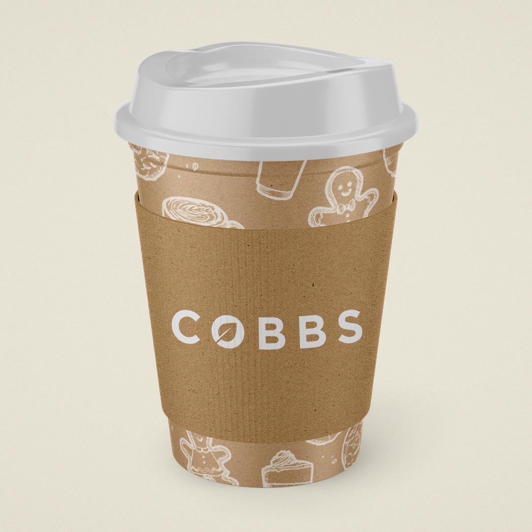
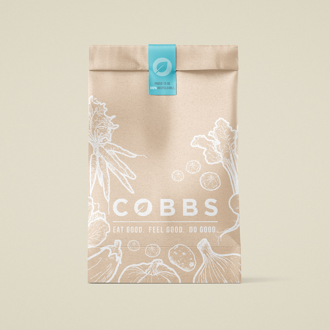
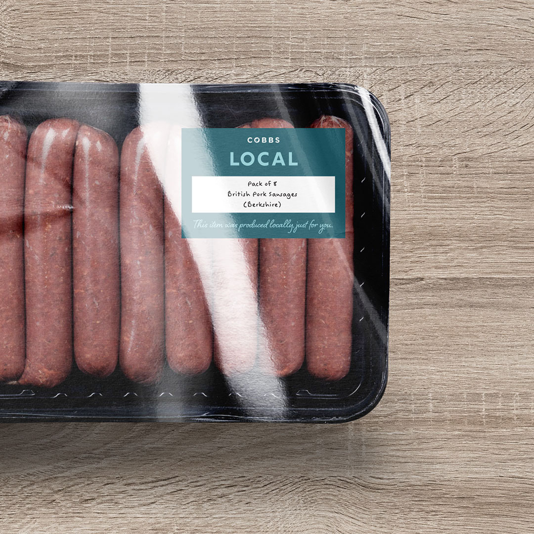
Application
Below are examples of how Cobbs could execute their refreshed brand onto packaging and signage, using the new colour palette and custom illustrations.